Responses
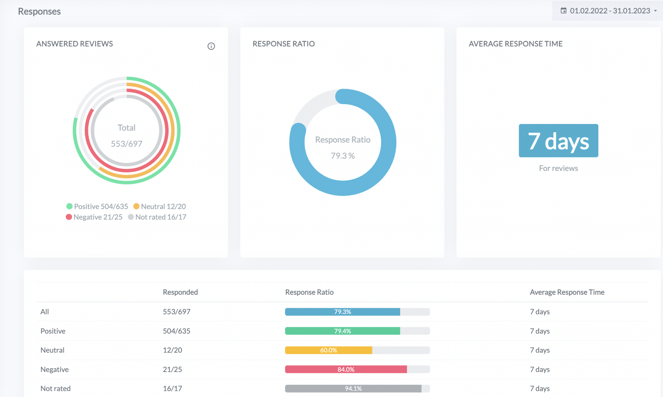
Choose Responses under Statistics on the left-side menu. This dashboard shows everything you need to know about your responses to online reviews.
Here you can check and analyze how many reviews were answered and how long it took on average.
In the calculation, we take into account all review sources which allow responses. If you are using re:spondelligent’s response service, only those reviews are taken into account that are subject to respond.
The widget below shows the response ratio and the average response time per each group of reviews: positive, neutral, negative, and not rated.
“Not rated” contains all reviews that don’t have a rating. For example, on Facebook users have options of “recommended” or “not recommended.

At the bottom of the page, you will find the Response Ratio chart, which visually represents the development of responses over a selected period.

